Chilight
"Simplicity is the ultimate sophistication." - Leonardo da Vinci
Introduction
Highlights Chicago Inc. worked with Designer & Gentleman to improve how people request their service. My job as a Product Designer was designing the MVP of the mobile app. Crafted for businesses and individuals, this app simplifies the process and sends a service request in just three steps. Future releases will include more features such as "get a quote" and a chat to speed up communication.
Step 1 | Identify the issue
The problem
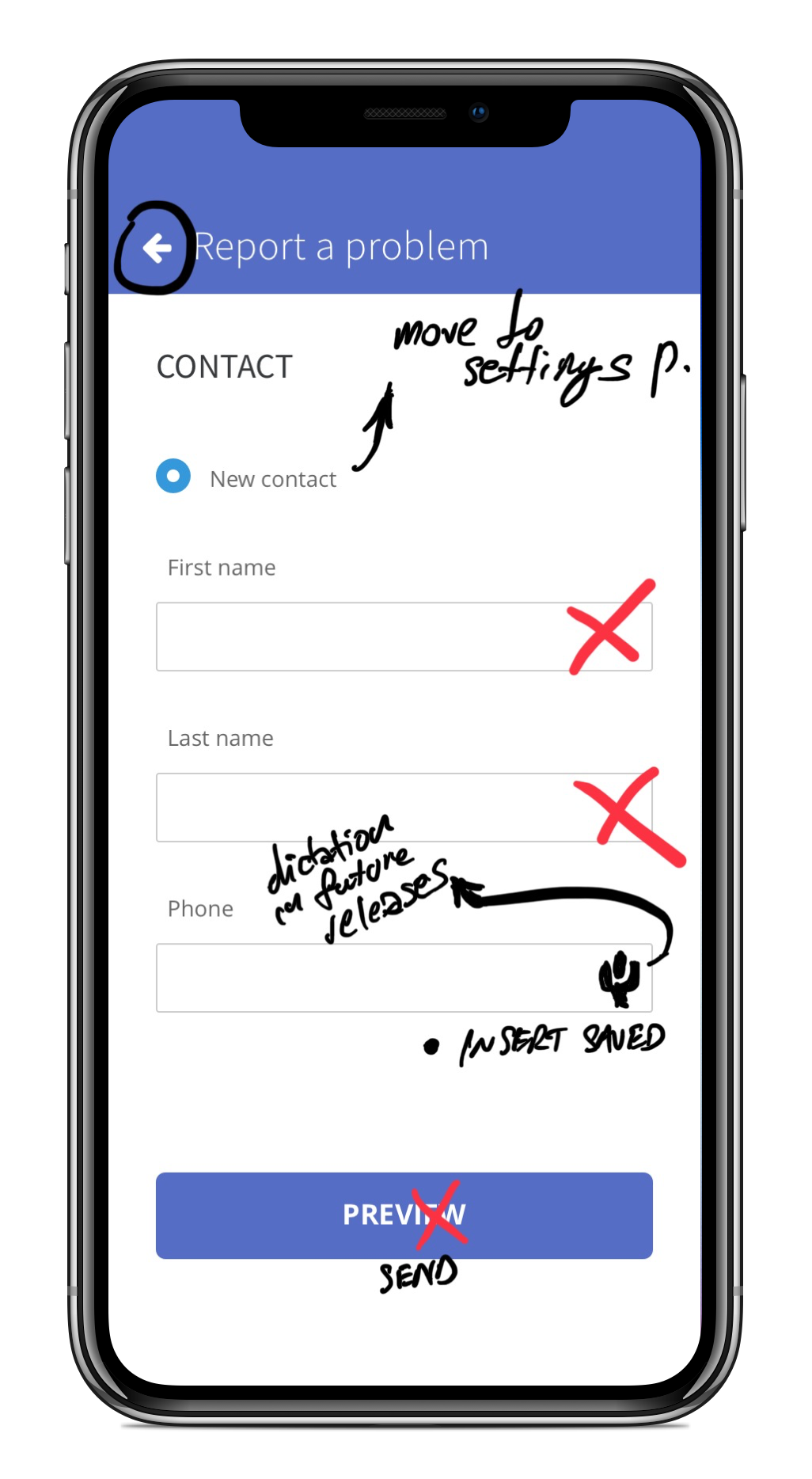
Requesting electrical service is currently not an easy process. There are three options available to users. The first one is to send an email, which is complicated as users need to type in all the required information, describe a problem, add location, add contact details, and eventually attach a picture of a problem.
The second one - to call - is easier, but this is an issue for the electrical company as they need to type in all the mentioned info to send it further to the electrician. The third one - to use the website request page is also not intuitive for end-users as they need to type in all the information and attach a picture.
Step 2 | Market Analysis
Competitive analysis
First, we identified the client's main competitors in the same market segment and evaluated their solutions. By analyzing the competition's strengths and weaknesses, we concluded that an app would make a substantial competitive advantage.
Step 3 | Product Evaluation
Heuristic evaluation of current solutions
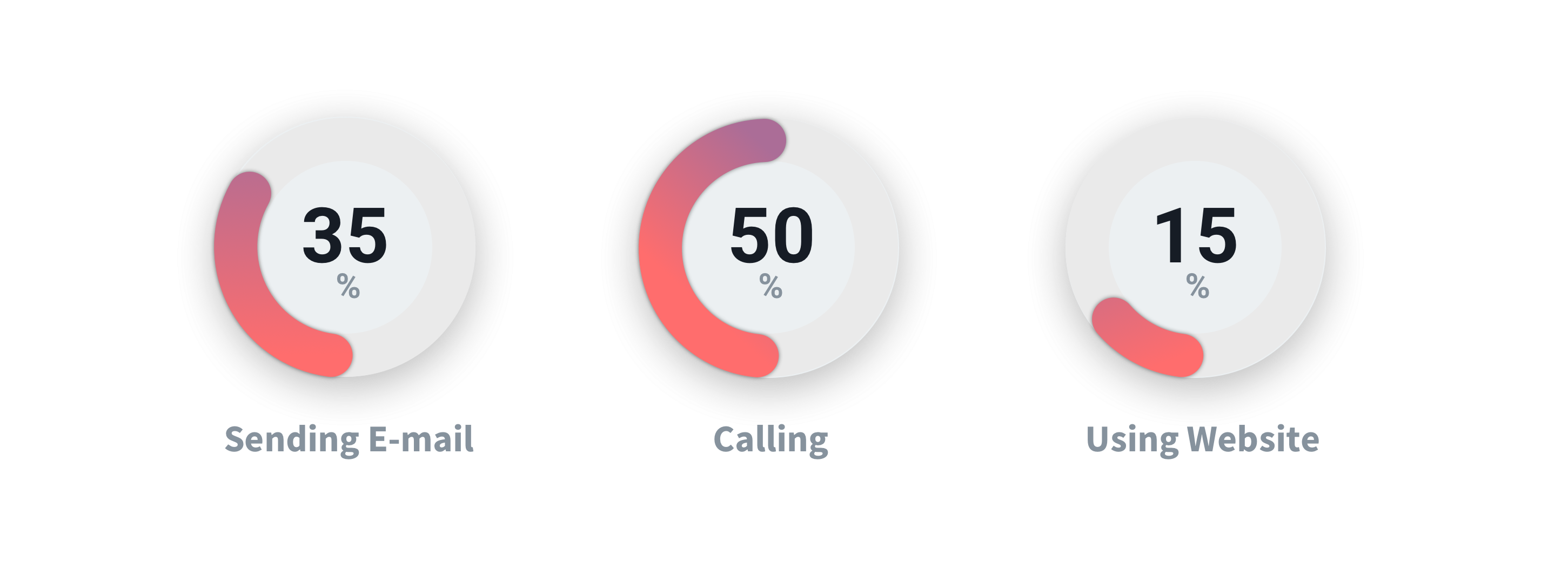
The next step was to identify existing communication channels provided by competitors and then to analyze the usage of similar communication channels within the internal system of our client. We also measured the time and effort needed to successfully send a service request to electricians, which we used as a starting point to simplify our solution.
Usage comparison of communication channels:
Step 4 | Sorting features
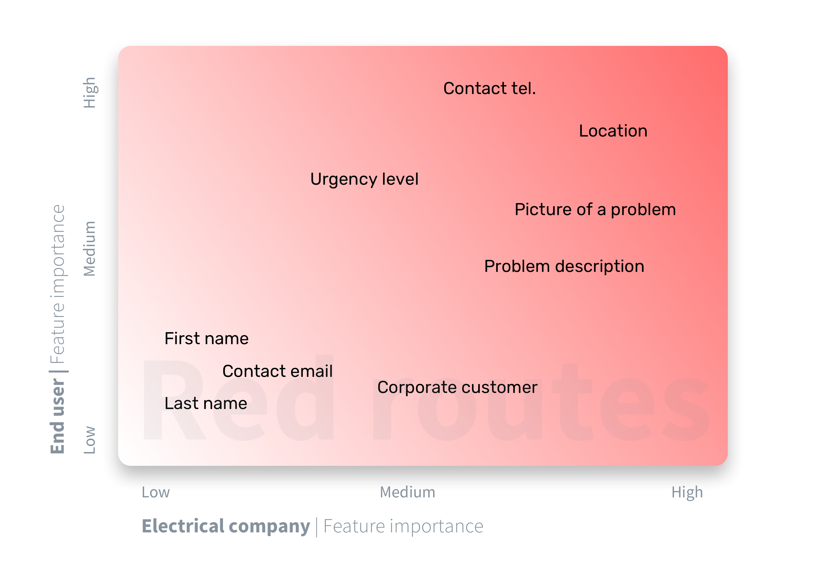
Red routes
The next step was to use red routes to prioritize features and eliminate any usability issues on key user journeys. Here we wanted to check what elements of a service request are the most important for users and our client and to put them on the map for a more accessible overview.
Red routes for the service request:
Step 5 | End-user analysis
User Journey map
We wanted to see how the end-user journey affects decisions and emotions and which steps in completing the fully documented service report create the most frustrations. My job was to create a simple user journey map to pinpoint the main issues for the MVP.
Step 6 | Target groups
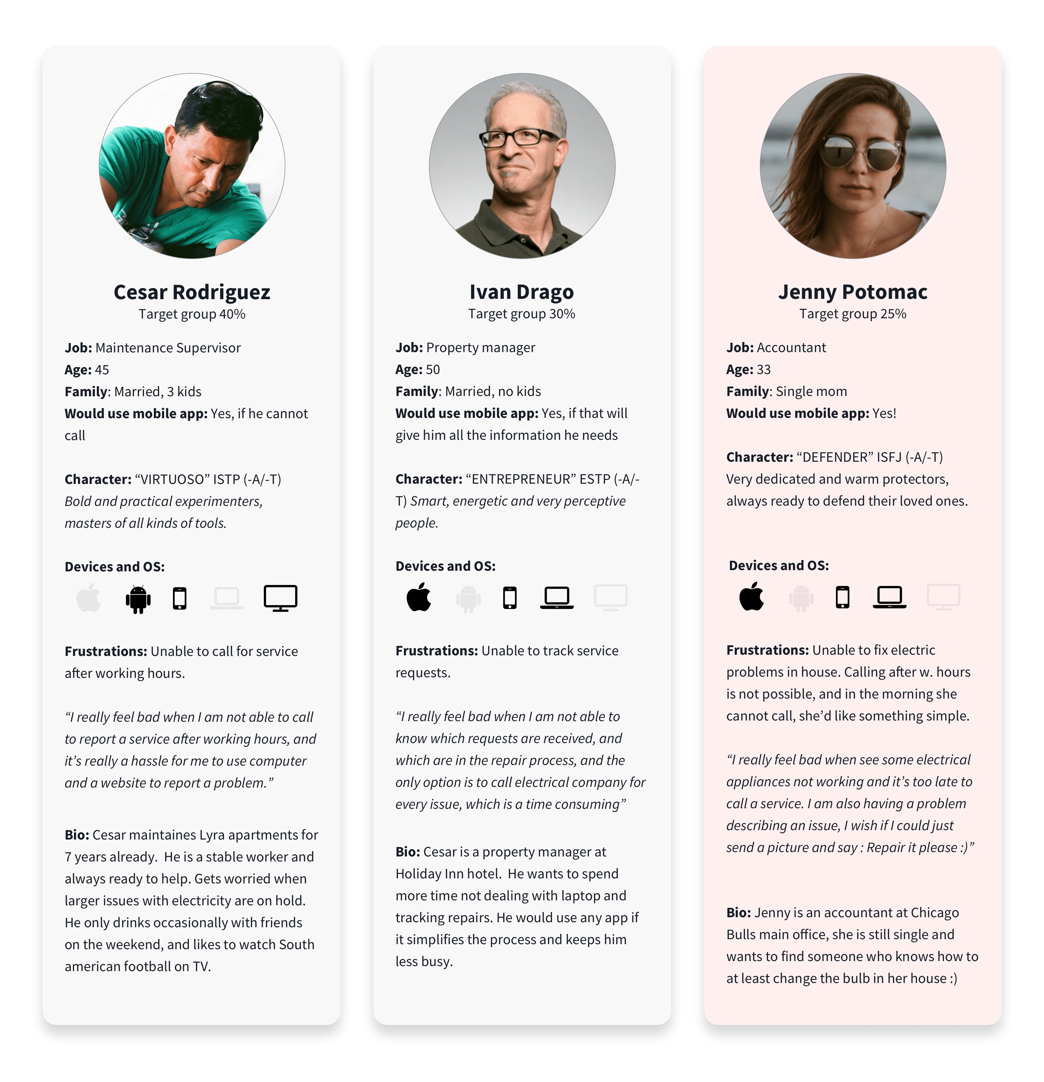
Personas
Every user is different, so our approach was to analyze Google Analytics data and talk with electrical company managers to understand the profiles of average users. We decided to create a detailed personas overview to help us stay on track and not miss any detail that users might find important.
Step 7 | Prototyping & Testing
Usability testing on high-def wireframes
The next step was to create high-def mockups to get as close as possible to the actual app to help reveal all the issues quickly through usability testing. Quick iterations based on feedback from five test users helped me understand the best user flow.
Feedback also revealed a gap between what users ask for, and what they actually need. This gap is becoming more evident as technology advances. Often, users are not aware of how advanced a solution might be. So they don't ask for such advanced features. Therefore, a designer's ability to recognize the need and to design an adequate solution is essential.
Step 8 | User feedback
Analyzing user feedback and Ideate
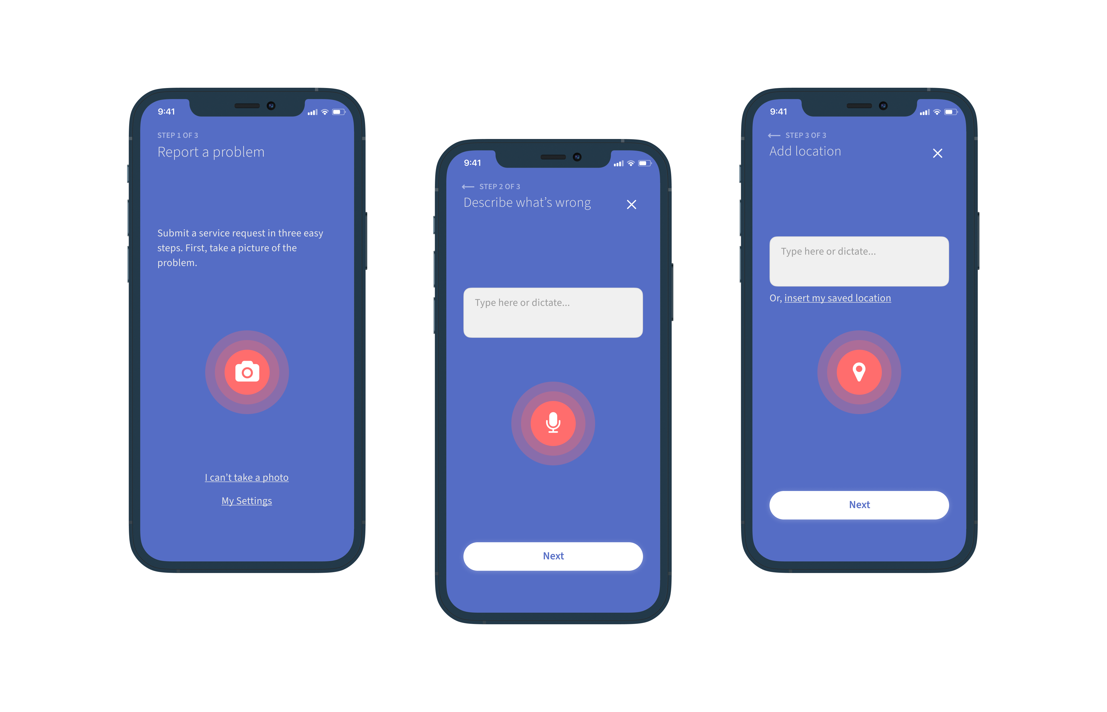
My next step was to assess everything gathered in previous steps and to iterate on the main wireframe. Iterations led me to a solution that uses only tap gestures and dictation to send a request for service in 3 easy steps. Moving the primary input method (typing) in the second plan helped me to speed up the overall process. The crucial thing was to minimize the number of steps needed to submit a service request.
With additional input options, like dictating to add a description of a problem or just tapping to be geolocated, the UI looked much cleaner and more intuitive.
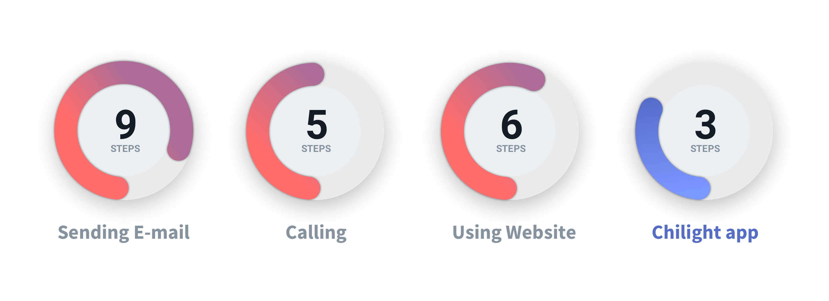
Comparison of steps required for the request to be received by an electrician:
Step 9 | Improvements
Dictate instead of typing
Current solutions on the market use six or more steps to send information from end-users to electricians. With Chilight, the main goal was to minimize the number of steps, leading us to just three steps to submit the request. In this phase, my job was to finalize the UI and place additional input options, like dictating and geolocating appropriately, while making room for regular text input.
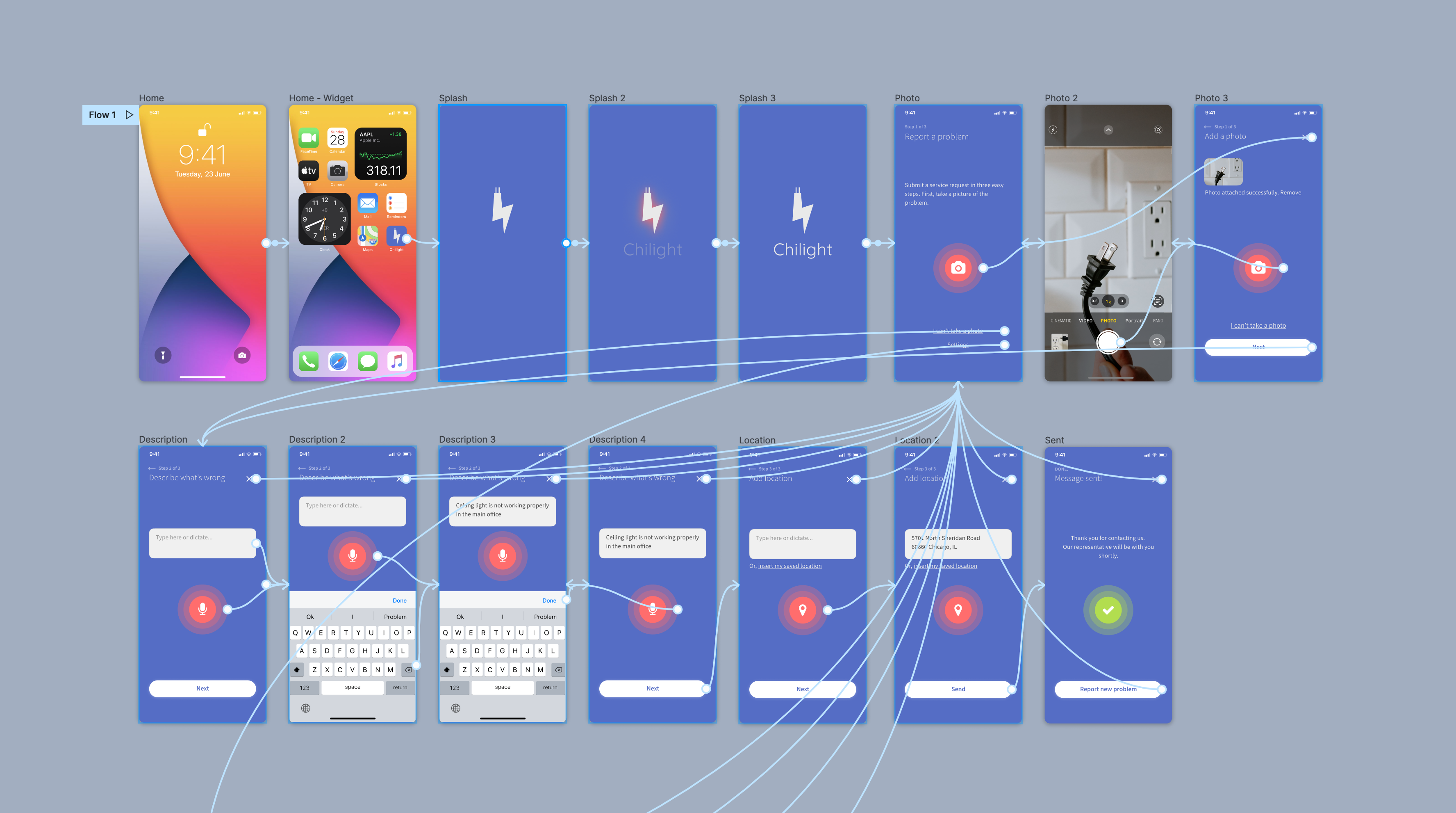
Step 10 | User Flow
INTUITIVE User Flow
The final user flow in the app has been perfected over several iterations and is tailored to simplify the process of requesting service intuitively and conveniently. Future releases will include features such as "get a quote" and two-way messaging to improve communication.